[Video transcript]
This is the Kubex main overview dashboard, and what we’re looking at is a view of a cluster that’s a lot of nodes, you’ll see the gray line be quite high. The orange line is the aggregate requests of all the containers on those nodes, and the blue line is the actual aggregate utilization of those containers.
And what you’ll see is at the far left of these curves, if I go way to the left here, you’ll see that the allocatable resources are quite far above the requested resources. So there’s a gap between the orange. The gray that’s typically indicative of inefficiencies in the node autoscaling. Maybe you’re running on the wrong node types. Maybe you need to do bin packing. There are more nodes running that need to be running given the requests.
And then the gap between the orange and the blue, that’s basically vertical scaling. That’s saying that all my containers are way too big. I’m asking for too much CPU or too much memory, and it’s causing a big gap both in CPU and memory. You see the memory gap’s even bigger. So all these containers, they’re just asking for too much memory that they’re not using.
So you see they start to come down at the point, they start to come down. That’s where the Kubex automation is flipped on. And when you turn that on, what it will do is either it has a mutating emission controller. It’ll do in place resizing, and it’ll very safely. Automate the correction of the requests and limits for the containers.
And what that looks like is the, orange curve coming down as you go to the right, and at the far right, you’ll see now there’s a much better alignment between requests and actual utilization. We’re not asking for way too much memory and way too much CPU. And as a result, the gray line will come down because the node autoscaler will start to consolidate. So technologies like, Karpenter or the OpenShift Autoscaler, they will auto consolidate as the requests come down. And again, what you see is a very high cost savings in this environment.
You’ll also notice at the very bottom, the container risks are down to zero because also fixed the limit. So we’ll get rid of out of memory kills and throbbing. Now you can actually even see this in action if I open up this automation pane here and I open up a namespace and let’s just open up a container.
And what we’ll see here is an actual automation event occurring where in this case the CPU request has been brought up. That’s the orange line going up. So we’ve added about 0.7 of A CPU to this, to de-risk it. This one wasn’t asking for enough CPU. So we automate in both directions. We’re going to upsize things to de-risk them.
And the memory side on the right, we’ll see the memory requests and limit the orange and the purple. Both coming down because this one was given way more memory than it actually ever uses. So that’s what the automation events look like and these are constantly happening in the background. You don’t need to look at it if you don’t want to. It will just magically bring the orange line down and you’ll save a ton of money and have fewer risks.
So this is one cluster that’s been automated. Let’s just expand out. I’m going to get rid of this filter for the top and look at all the clusters in this demo system. And there are 18 of them. And again, you see it’s a bit of a mess. So that one looked great. These ones less so. And what we need to do is do the same thing on these ones.
So the gray line is way above the orange, which is way above the blue. So we have a lot of waste here. We also have a lot of node risk. We have nodes that are out of memory or running hot on CPU. We even have nodes that are after max pods per node, and that’s very important. So we see a lot of times a lot of money can be saved just by fixing the max pods per node setting in the cluster.
So there’s a lot of things to be done here to save money very quickly, and they’re all listed down here as well. And I can actually drill down on any of these things and get very quick visibility into the cost savings opportunity.
This is a different cluster, this one’s not been optimized. And I’m looking at the cluster and seeing that it’s 73% waste. So there’s a big opportunity here. I can look at the node groups and say, yep, this looks like a problem. It looks like the requests are way above utilization. There’s probably a lot of oversized containers in these environments that we can fix.
And through automation, we can bring that orange line down and again, save a ton of money in this cluster as well. The recommendations that do that are right up here. This cluster has about 700 containers running and there’s recommendations on over 400 of them. So there’s a lot to fix here, and I can click there and get right to the recommendations.
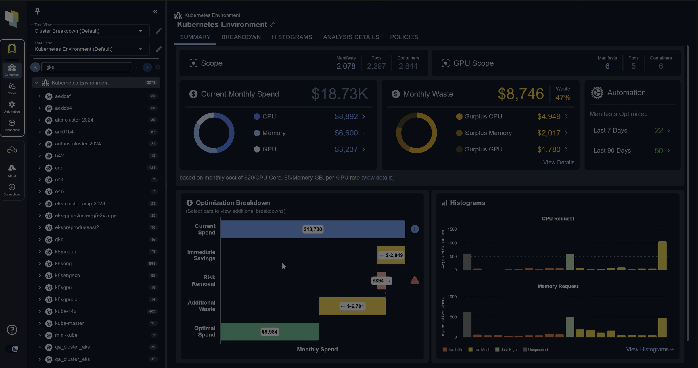
But what I’m going to do here is click on this histogram icon, and that takes me to a visual of that cluster and how bad the sizing is. And the way you read this is, and this is quite useful because I can see at a glance. There are a lot of containers where the CP request is way too big. This 500% means containers have five times more CPU given to them than they need.
So yellow is cost, red is risk. Some of them are too small, gray is that you don’t have a value. And so for CPU, there’s a lot of oversizing for memory. There’s also a lot of oversizing, also a lot that don’t have a value from memory.
And I can do this for any individual cluster. I can look at any group of containers. I can even go up here and say, just show me my whole company. And that’s what it looks like. And this is exactly what we see in environments that we analyze where there’s big yellow bars, a lot of cost savings opportunity, and a lot of risks.
So red and gray are risks. So I’ve got cost here. I’ve also got added memory kills in this environment, and we’re detecting all those and the automation will fix them.
Now, if I want to know what the automation’s going to do, I can just click on any one of these yellow bars and I’ll get to the list of recommendations. So these are the top ranked oversized containers in my whole company, in this case.
If we look at this first row, it’s an analysis container that’s been given four CPUs and only needs about one and a half. And I can actually drill down into that if I want to. We provide a lot of evidence for our recommendations.
This is the 24 hour machine learning pattern model for that container. So we look at all the historical data and say, this is what this container typically does. It typically fluctuates between just under one CPU; the top of the thin zone is the peak. The top of the thick zone is the sustained activity.
So it peaks just above one CPU early in the morning and then midday it does get busier; it peaks up almost to three CPUs and it has sustained activity over one CPU. So we’re saying for this workload the current request is 4,000 milli cores. You could get by with 1,600 milli cores. It’ll work just fine and you’ll save a ton of money.
And I can even go down and look at the hourly patterns back through time. I can look at the five minute samples if I want to, to make sure this is safe, but the idea is if I trust this answer. I can just automate it.
And this one will be pretty impactful because this container’s replicated 30 times, so it’s actually wasting about 70 CPUs, just this one container. And if I turn on automation, that’ll go away and it’ll be fixed.
If you want, you can drill down into our dashboards and see all the analysis of the environment. You can see all the recommendations. We can see costs related opportunities. We can see the risks.
Here are a set of containers that are actually experiencing at a memory kills. Because they’re hitting their memory limits. And so if I could, DynamoDB the second one in the list, this is a good example. This one’s kind of living at its limit a lot of the time, the purple line. And as a result, it’s getting a ton of out of memory kills.
The automation will fix this as well. We’ll bump up that limit and say, Nope, let’s get the limit out of the way. You can see the dotted line is a recommendation and we should fix all those problems as well.
If I want to drill down and see the recommendations, that’s how I was generating it. If I need to communicate this to an application team saying, Hey you need to downsize or upsize these are all deep linkable, so everything I showed you can just grab a link to it and send it to someone; attach a ticket if you want to.
But again, the goal is just to turn on automation. And if I flip on automation in this environment, those yellow and red bars will go down and the green bars go way up.
And I can actually see that if I pop open the tree view in my environment I can see here’s a cluster that’s not been optimized. Down the left, these are all my clusters and namespaces. And here’s one that’s not been optimized, where it’s a bit of a mess. There’s over and undersized containers everywhere.
And if I flip on automation, it looks like this. And when it looks like that, that’s what causes it to look like what I showed in the overview where if I go back to that one cluster, it’s been optimized and again, we’re saving money and we have lower risk.
Thank you.